Maskless, capeless, free (4KB Executable Graphics)
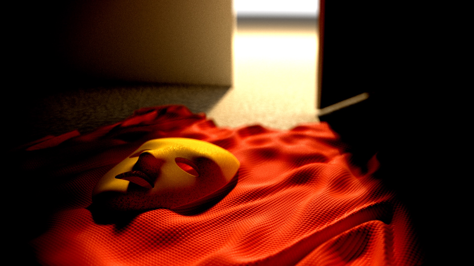
Released at Hogmanay 2020, 4KB Executable Graphics (a single 4KB executable file generates this image, with no external data).
A sequel to ‘Kept in a Box’
‘Kept in a Box’ felt important to make, but it also felt very dark, and maybe not an ideal piece to release at a New Year’s Eve party. So I wanted to do a second piece that was lighter, and decided to make a sequel.
Where Kept in a Box was about staying in the closet voluntarily for the protection of others, this is about finding a way out of that situation.
The hero or heroine is no longer needed, drops their mask and cloak, takes the key and walks out through the open door into the light of freedom. The mask and cape represent both the heroic nature of the imprisonment, and the disguise they no longer need now they can show the world their true self.
Background
The scene setup is the same as Kept in a Box - a light outside the scene, low this time to cast a beam of light through the door and with a bright sky to provide more ambient light. There’s no room again, just one wall with a rectangle removed to form the doorway and a box to form the door.
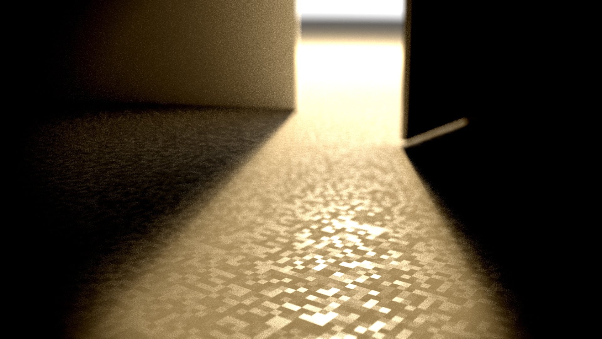
You can also see the floor ‘texture’ here - I’m setting the material roughness randomly. It’s pixellated, but that doesn’t matter because it’s covered.
Cloth
The cloth is an SDF. The material is matt red, but with a slight reflective fresnel layer to give it a little sheen. It’s a flat disk:
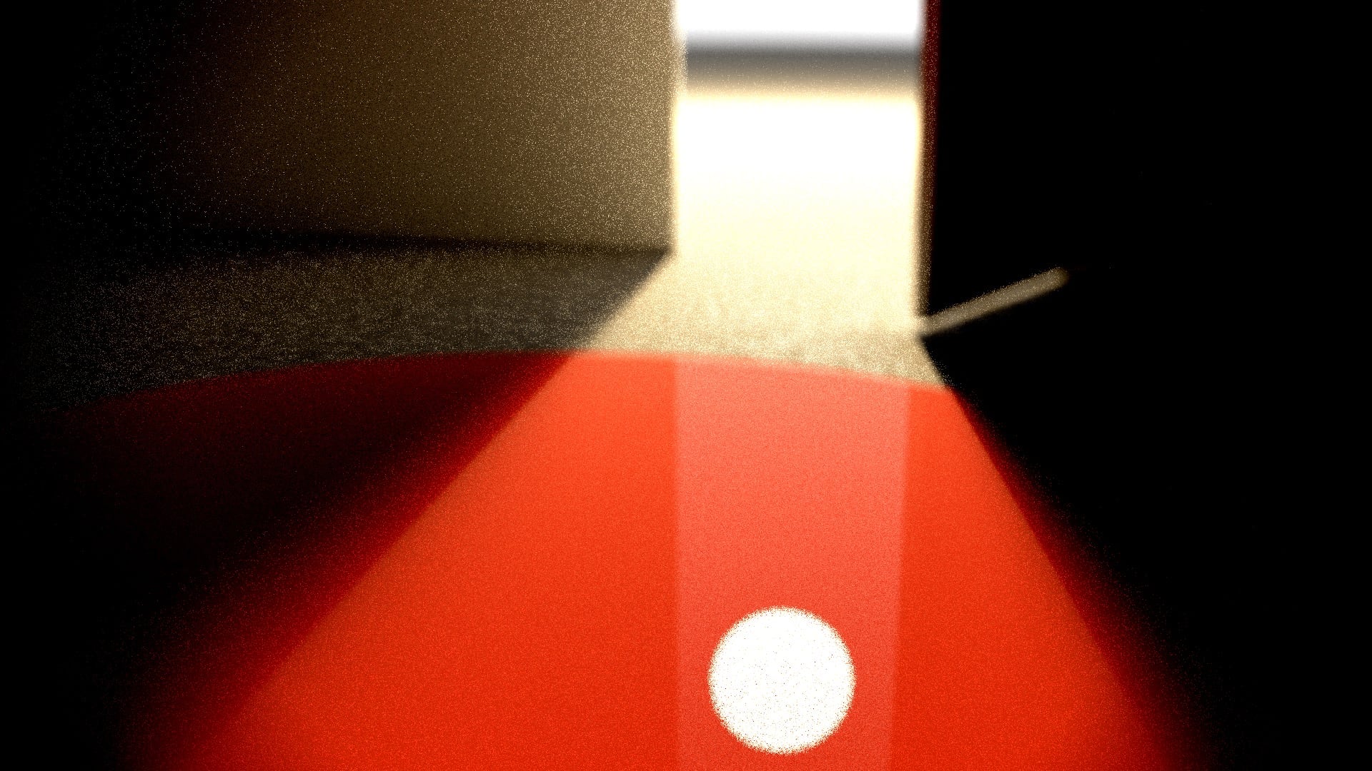
To which I just added some sine waves together and added them to the height, it’s cheap and nasty and looks like a wave pool here but looks like rumpled cloth in the end 🤷♀️
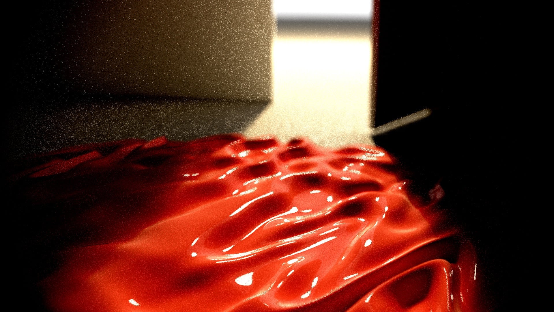
For fine detail I just added another couple of sine waves at right angles to make it look a bit like a cloth texture.
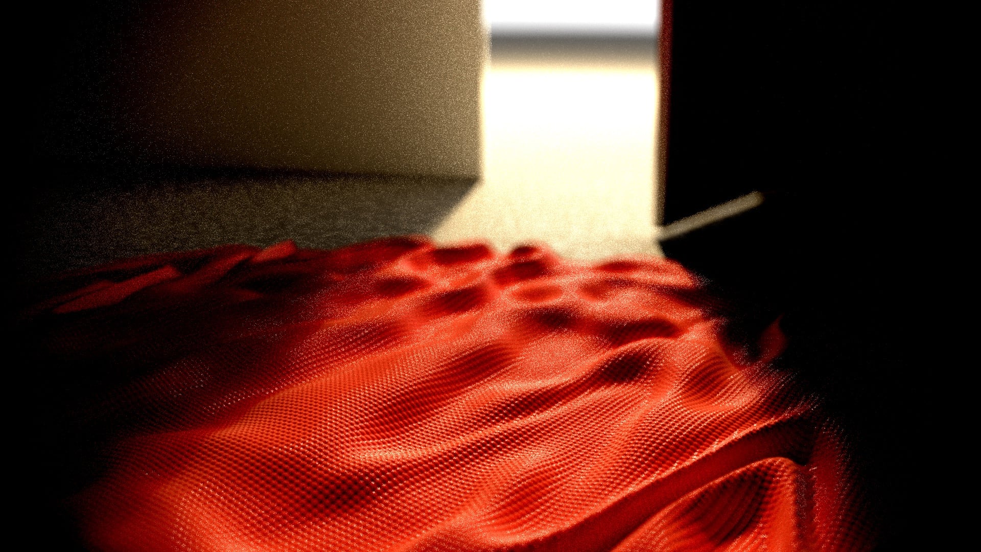
The last step is to add some distortion parallel to the floor so it doesn’t look obviously round.
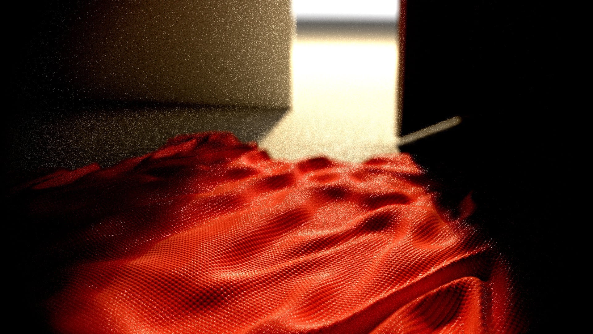
Mask
The mask is just part of a sphere, with a few boxes blended in to give it a face shape and some holes punched through for the mouth and eyes. I gave it a bit of thickness to make it look solid.
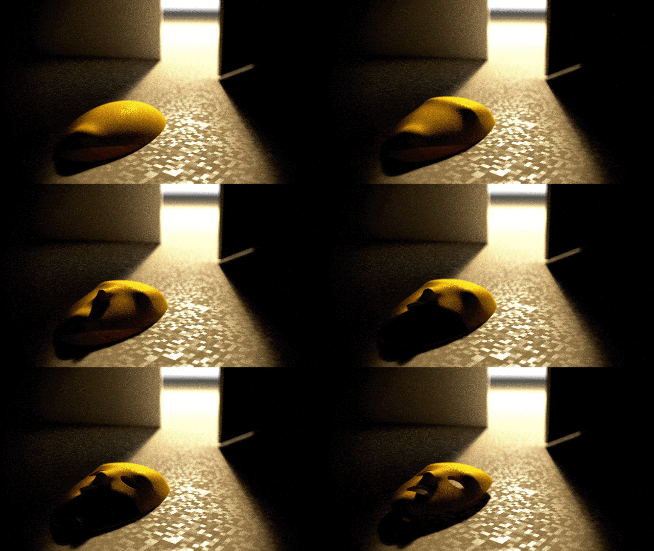
The material is a roughened gold. It’s the same technique as the floor - I just use the surface position to generate a random roughness value.
Post
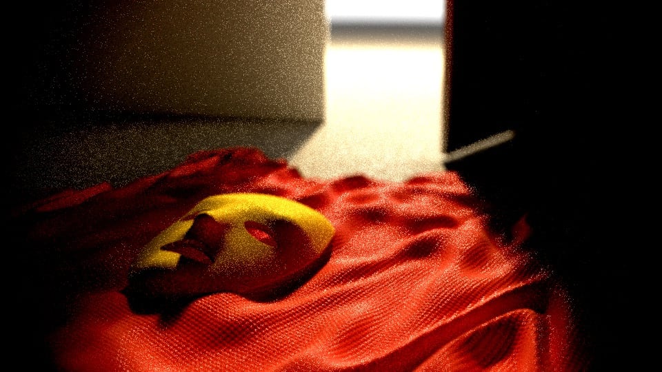
The post setup is similar to last time. Raw output:
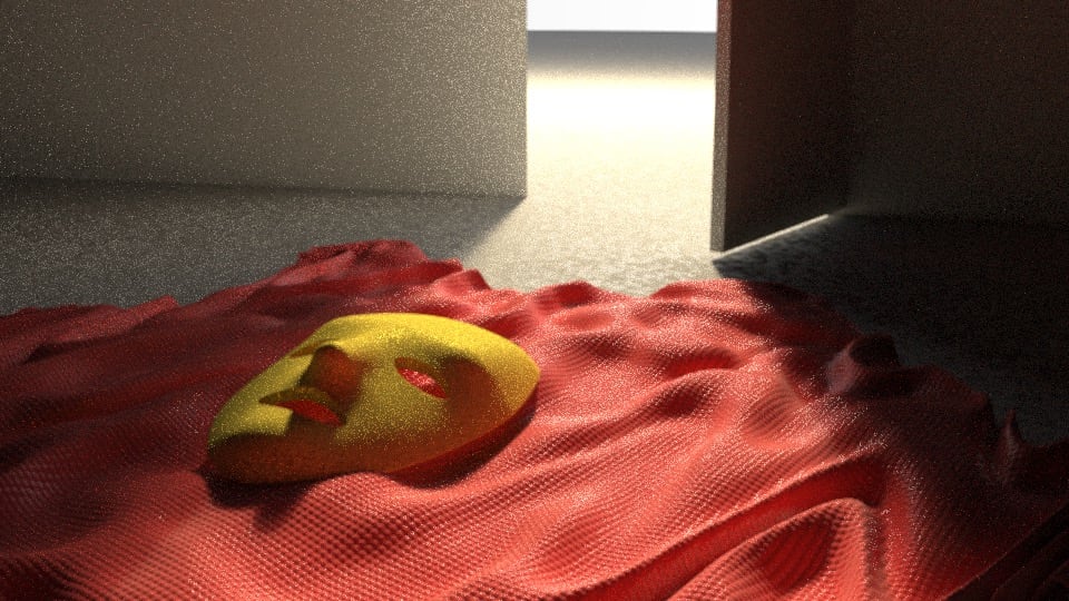
Increased contrast:
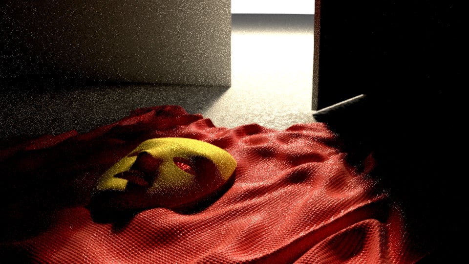
This time I wanted warm, rich colours so I increased both saturation and warmth:
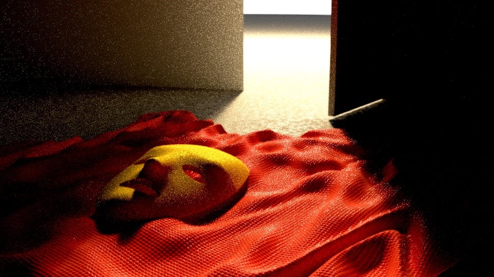
Finally depth of field and vignette:
